User Interface
Theory
The whole Ajenti UI is a DOM tree of ajenti.ui.UIElement objects. After each update, the UI tree is serialized into JSON and sent to browser, where HTML DOM is assembled from it with the help of CoffeeScript code.
Unlike conventional web apps, Ajenti is a stateful machine, which means you adopt a simple workflow similar to developing desktop apps, not websites.
Example
from ajenti.api import *
from ajenti.plugins.main.api import SectionPlugin
from ajenti.ui import on


@plugin
class TestPlugin (SectionPlugin):
    def init(self):
        self.title = 'Test'  # those are not class attributes and can be only set in or after init()
        self.icon = 'question'
        self.category = 'Demo'

        """
        UI Inflater searches for the named XML layout and inflates it into
        an UIElement object tree
        """
        self.append(self.ui.inflate('test:main'))

        self.counter = 0
        self.refresh()

    def refresh(self):
        """
        Changing element properties automatically results
        in an UI updated being issued to client
        """
        self.find('counter-label').text = 'Counter: %i' % self.counter

    @on('increment-button', 'click')
    def on_button(self):
        """
        This method is called every time a child element
        with ID 'increment-button' fires a 'click' event
        """
        self.counter += 1
        self.refresh()
Add a subdirectory layout and place a file named main.xml there:
<body> <!-- an overall plugin container panel -->
<pad> <!-- adds whitespace padding -->
<hc> <!-- horizontal container -->
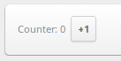
<label id="counter-label" />
<button id="increment-button" text="+1" style="mini" />
</hc>
</pad>
</body>
Now restart Ajenti. The new plugin Test will be visible under Demo category. Clicking the +1 button will increase the counter.
The visible part of plugin is an UIElement, inherited from ajenti.plugins.main.api.SectionPlugin.
When you click the button, the ‘click’ even is fired down the UI tree. The first method to have correctly decorated @on method will handle the event. Alternatively, you can set event handler on the element itself by adding this code to init:
self.find('increment-button').on('click', self.on_button)
List of UI Elements
Containers
<box>: Box
Simplest container ever, can be scrollable
@p('width', default=None)
@p('height', default=None)
@p('scroll', default=False, type=bool)
<pad>: Whitespace
Adds a padding on four sides.
<indent>: Indentation
Adds a padding on two sides.
<right>: Pull-to-right
Pulls its content to right with float: right
<hc>: Horizontal Container
A horizontal stacking container
<vc>: Vertical Container
A vertical stacking container
<formline>: Form Line
Container for form controls, has a caption
@p('text', default='', bindtypes=[str, unicode])
<formgroup>: Form Group
Provides a nice form section separator
@p('text', default='', bindtypes=[str, unicode])
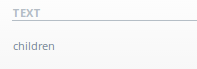
<dt>, <dtr>, <dth> <dtd>: Data Table
A lined table
<dt>
    <dtr>
        <dth text="Header" />
    </dtr>
    <dtr>
        <dtd>
            <label text="Child" />
        </dtd>
    </dtr>
</dt>
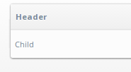
<collapserow>: Collapsible Table Row
A click-to expand table row
<dt>
    <collapserow>
        <label text="Header Child" />
        <label text="Body Child" />
    </collapserow>
</dt>
First child is a header and always visible. Second is the collapsible body.
@p('expanded', default=False, type=bool, bindtypes=[bool])
<lt>, <ltr>, <ltd>: Layout Table
An invisible layout grid (no padding).
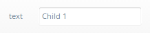
<sortabledt>: Sortable Data Table
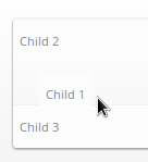
User will be able to reorder rows
<sortabledt>
    <dtr>
        <dtd>
            <label text="Child 1" />
        </dtd>
    </dtr>
    <dtr>
        <dtd>
            <label text="Child 2" />
        </dtd>
    </dtr>
    <dtr>
        <dtd>
            <label text="Child 3" />
        </dtd>
    </dtr>
</sortabledt>

@p('sortable', default=True, type=bool)
@p('order', default='', type=str)
The order property holds the reordered element indexes ([2,1,3] as seen on the image)
<tabs>, <tab>: Tabs
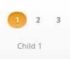
User will be able to reorder rows
<tabs>
    <tab title="1">
        <label text="Child 1" />
    </tab>
    <tab title="2">
        <label text="Child 2" />
    </tab>
    <tab title="3">
        <label text="Child 3" />
    </tab>
</tabs>

<tabs>:
@p('active', default=0)

<title>:
@p('title', default='', bindtypes=[str, unicode])
Standard Controls
<label>: Label
@p(‘text’, default=’‘, bindtypes=[str, unicode, int, float])
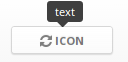
<button>: Button
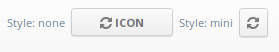
@p('text', default='', bindtypes=[str, unicode])
@p('icon', default=None)
@p('warning', default=None)  # display a warning text before click

click()  # fired on click
<icon>: Inline Icon
Icon IDs in Ajenti are coming from this page: http://fortawesome.github.io/Font-Awesome/icons/
@p(‘icon’, default=None, bindtypes=[str, unicode])
<progressbar>: Progress Bar
@p('width', default=None)
@p('value', default=0, type=float, bindtypes=[float]) # between 0.0 and 1.0
<list>, <listitem>: Lists
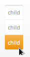
A list with clickable items:
<list>
    <listitem>
        <label text="child" />
    </listitem>
    <listitem>
        <label text="child" />
    </listitem>
    <listitem>
        <label text="child" />
    </listitem>
</list>

<listitem>:
click()  # fired on click
Inputs
<textbox>: Textbox
@p('value', default='', bindtypes=[str, unicode, int])
@p('type', default='text')  # or 'integer'
<editable>: Editable Label
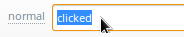
A label that becomes textbox when clicked:
@p('value', default='', bindtypes=[str, unicode])
@p('icon', default=None)
<checkbox>: Checkbox
@p('text', default='')
@p('value', default=False, bindtypes=[bool])
<dropdown>: Dropdown Select
@p('labels', default=[], type=list)
@p('values', default=[], type=list)
@p('value', default='', bindtypes=[str, int, unicode])
<combobox>: Combo Box
@p('labels', default=[], type=list)
@p('values', default=[], type=list)
@p('separator', default=None, type=str) # if set, combobox becomes autocomplete-multiple-input-box
@p('value', default='', bindtypes=[str, unicode])